6. What have you learnt about technologies from the process of constructing this product?
laptop/ computer -
Whilst producing my magazine i used the school computers in lesson time, after school, and in my free lessons in order to complete the task. At home i was able to use my laptop by downloading the free version trial of photo shop. This gave me some extra time to make changes and keep working on my magazine to get it right.
Adobe Photoshop 9-
This is the software i used to create my magazine. I was able to effectively use the tools it has to offer to edit the magazine. From my preliminary work, i learnt and developed my skills in order to use the software at its best.
Nixon camera-
I used this camera to take pictures of my artists, it is a 5 mega pixel camera and was available to me from home. I felt this was the best way to take my pictures as i have it at hand. I also used this camera to take pictures of my other artist seen in the contents page. I think the quality of the images was the best i was able to do.
Microsoft word-
I used this to spell check my double page spread, contents page and front cover i also used this to keep a word count.
Animoto-
I used this to make a brief mood board for my artist profile and target audience.
Memory stick-
I used a memory stick to transfer my images from my camera onto the school computers where photoshop is installed. This allowed me to edit the images and post on my blog some of the shots i was able to get.
Internet-
I used the internet to do the majority of my research alongside using music magazines. This came in handy as it allowed me to view up to date music magazines and artists that people were interested in.
Thursday, 5 April 2012
Friday, 30 March 2012
Evaluation (final) 7
Looking back at your preliminary task, what do you feel you have learnt in the progression from it to the full product?
From doing my preliminary task i feel i have progressed massively. I have learnt how to use software such as Photoshop, and my camera skills developed. From doing my preliminary task, i have also gained knowledge by researching music magazines of how certain conventions work and which ones don’t. I have also picked up on things such as barcodes being to big or to small,. This is something that doesn’t sound important but can take away the interest from the main cover image.
Skills i feel i have developed the most would be my photo shop skills, in my first task i was only able to work the basics and struggled to sufficiently cut images out. I was also able to change contrasts which i had already learnt from studying art. My magazine is now of a higher standard since using Photoshop and i therefore feel my magazine has progressed from learning the different tools Photoshop has to offer, for example the layers. I believe my progression is obvious throughout the course from looking at the different of my preliminary and final magazine.
Since the preliminary i studied various magazines such as Q, Vibe, and kerrang. I thought this would enable me to have a broad knowledge of many different genres and i soon learnt about different conventions that would be appealing to my specific audience. I also learnt about Laura Mulvey, and the rule of three; things i could use in order to make my magazine successful. Whilst doing my final magazine i also had different versions of contents pages, double page spreads, and front cover. I did this so i could successfully make my magazine aesthetically pleasing. I also learnt what didn’t work well and what did. Where as when i did my preliminary i felt the front cover was to minimal, this is something i took on board when it came to producing the final magazine and in contrast to the i feel preliminary, my magazine now is far more detailed and looks more appealing to my target audience. I also felt that my contents page was to vague, i changed this and decided to section what the magazine has to offer. I felt this worked well as it appeared neat and tidy and easy to read for my audience. Another decision i decided to do was have more than one artist in my magazine, whereas with my preliminary i focussed in on just one artist, this took away from the idea of it being a genuine magazine. I also took different images of my artist wearing different outfits which show the versatility and what i had to work with. This gave me more options and i ended up with a good front cover image of my artist.
Tuesday, 27 March 2012


Tuesday, 20 March 2012
3. Evaluation (final)
3. What kind of media institution might distribute your media product and why?
 IPC produces over 60 iconic media brands. It's the leading magazine publisher. I think this distributor would best suit my magazine as they have years of experience in producing top quality magazines. Publishing a magazine makes it available to the public for purchase. The corporation doesn't have a music magazine mainly targeted at women so there is a gap in the market to make my magazine work. I would have my magazine at a fixed price of £4 each month as the target audience I am aiming my magazine at would be able to afford this as they have a disposable income. Ways in which I could distribute my magazine would be on the shelves, through the internet and postage to subscribers. Funding for my magazine would come from adverts such as headphones, clothing, new albums and things such as festival adverts. Magazines that would be released in a similar way to mine are ones such as I.D, IPC publishes newspapers such as The Sun and the Daily Mirror.
Monday, 19 March 2012
4. Evaluation (final)
Who would be the audience for your media product?
My audience for my magazine will be both male and females. My magazine is a pop genre so my audience will therefore reflect this interest. However, i feel my magazine predominantly targets females.
 For example, 18 year old Mattie White, who would be interested in my strap lines such as winning a free i Pod, and free posters. Mattie is a fashionable girl who likes to update her look on a regular basis. She likes to shop at Topshop, Urban Outfitters and Cow. The type of music she would listen to is, Rhianna, Coldplay, Jessie J, Katy Perry, and Nicki Minaj, all pop artists. Mattie likes to watch The only way is Essex and catch up on Geordie Shore. She would be interested in my magazine because it focuses on the pop genre and is specific to her age range. I think the general theme of the magazine is appealing to her and her friends as its bright fun and exciting.

Wednesday, 14 March 2012
1. Evaluation (final)
1. In what ways does your media product use, develop or challenge forms and conventions of real media products? (i.e. of music magazines)


This was one magazine that influenced my work the most, there are similarities between my work and this cover from VIBE but in some areas I have challenged this real music product where I felt was necessary to improve certain elements of my own work.
Masthead.
My masthead and the masthead from VIBE are slightly similar, however, I made a challenging yet conscious decision not to have my title in blue after researching different fonts and finding one that I believe to suit my work and reach my target audience and attract the social group of "pop" music fans. I introduced the strap lines above my masthead as they work well on the VIBE magazine and lure in the interests of different music fans, that perhaps would be interested in the celebrities Jessie J and Katy Perry. It also makes my masthead more prominent and draws attention to the title "THE BEAT". It also allowed me to play around with the colour scheme and to use it to make certain lures stand out from others and keep it looking interesting, fun and pop.
Cover lines.
The VIBE issue and my issue have both used cover lines to interest the target audience and lure in customers. I decided to use certain elements of the VIBE magazine to make my cover lines interesting and stand out. For example, "His 50 greatest songs" I have used on my magazine as "Her 50 geatest songs" fans of the artist will be intrugued by this and it works well.
Artist featured on page.
The artist on VIBE and my artist are completely different. Kanye West is seen looking stern and slightly glum whilst my artist looks fun and funky. I delibeitly challenged the form of a real music magazine as my artist works well with the genre of my magazine and attracts the social group that i intended of 13-20 year olds.
Layout
The layout between these two magazines are very similar, they both use the same colour scheme and the same layout. However, i didnt want to abide by this magazine which is why i changed and challenged certain elements such as the title, strap lines and barcode in order for my magazine to stand out on the shelf. I feel my front cover is simplistic in areas yet busy in others, I think this works well as the main image attracts my audience and the strap lines lure in other readers.


Tuesday, 13 March 2012
2. Evaluation (final)
2. How does your media product represent particular social groups?
When it came to choosing my main artist I wanted to create a fun carefree persona that resembled a typical pop artist. I decided to feature a young brunette girl as my main artist as I found from my research that typically women were preferred on the front cover, have more saleability, and would represent the particular social group I chose. My choice of artist was strongly influenced by the singer Katy Perry; she’s young, fun, care free and looks great. I chose several different outfits for my artist; one that appeared most popular was the "boy" top which is associated with stars such as Jessie J and Rihanna that i decided to include in my magazine as they have a huge fan base of teens and adults that love their music. From my research a cover that inspired my "pop" theme was VIBE, featuring Kanye West. The colour scheme immediately stuck and I portrayed the colour scheme in the "pop" genre of my music magazine. This was something I thought my target audience would appreciate and enjoy.
Friday, 9 March 2012
Front cover changes

Thursday, 8 March 2012
Contents changes

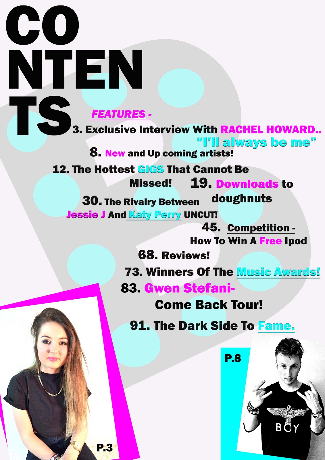
I have rearanged my contents page to fit the new artist. I have moved the title to the top left and moved the features further up to make room for the new image. I think by having Rachel on the pink background and Sam on the blue works well as its typical boy and girl colours.
Wednesday, 7 March 2012


Monday, 5 March 2012
Draft feedback

1= Mast head is the right size but needs to fill the width of the cover.
2= Font choice is good for masthead. It works well.
3= Colour scheme is good, you just haven't made enough of the pink and blue. As they are used at the moment they lack impact.
4= Text is to thin it needs to be more distinct/blocky and stand out on the cover.
5= Barcode is huge (resize smaller)
6= Where is price/month/issue etc
7= image lacks interest. you need to take more pictures. The ones you have posted on your blog aren't good enough. You have to take about (at least) 50 before you start to see good shots. The girl looks good its the shot that let her and the cover down.
8= Cover star is fuzzy in the middle of the page she needs to be repositioned.

10= one image will do, devote the rest of the space to the article. Im not convinced by this charity aspect. It seems a bit boring and dull. You'd be better off sticking to more normal and cooler music magazine content.
11= Pictures are an issue they are not good enough here either
You've got the skeleton of a decent idea. You'll need to make a proper effort to sort it all out.
Contents final magazine - Step 2

I have decided to change the background of my magazine slightly and have the letter "B" in the style of my title on the title page. I thought this would work well as it stands for "Beat" which is the title of my magazine. I like the way it works as it doesnt stand out to much or take away from my magazines features. Its also similar to the contents page i researched and found of Kanye West from VIBE.
Friday, 2 March 2012
Contents page- Step1

This is my contents page so far, i liked the layout of this magazine down below so i have decided to take some inspiration from it. However on this page, there is only one artist and for my magazine i think it would work well if i had images of different artists so its not the same thing throughout.

Additional Research and planning

Whilst doing the photo shoot i helped my artist feel compfortable by getting my magazines out and showing her some poses that i thought would work well on my magazine cover. These came in handy and i was able to get some really good shots. I also took these layouts into consideration when it came to doing my actual magazine.


Subscribe to:
Posts (Atom)